Readable Report: Turning Data Chaos into Clear Insights for Small Business Owners”
Background
Readable Report is a SaaS startup I co-founded. It was built upon the concept of delivering small business owners easy access to their valuable online data by automatically delivering concise and informative reports.
Users would receive an easy-to-read report detailing everything that's happening for them online like seeing how much money they made, discovering social media followers gained/lost, visualizing newsletter subscribers gained, and total website visits.
Challenge
From a product and design perspective, the omnipresent challenge was packaging and delivering massive amounts of complex data in a way that small business owners would want to understand and find useful.
Stitching together a user's logical understanding of the importance of data with a pleasing experience was the foundation of all design decisions.
Research
The speed at which individuals and businesses are creating data is rapidly growing. By 2025, it’s estimated that 463 exabytes of data will be created each day globally.
From a personal perspective, every time I attempted to look at my social media metrics, website performance, or business transactions I became overwhelmed.
Logging in to multiple sites, comparing disparate metrics, and convoluted charts proved to be more effort than seemed necessary.
Based on interviews and surveys there was a market for a tool that would ease most of the friction by delivering an automated, easy-to-understand, and actionable report.
Design Goals
The principal objective was to distill cold data into actionable insights for individuals operating small businesses.
A user's digital presence and the subsequent performance had to be easily consumed, transformed, and delivered in a desirable package.
Process
PRODUCT BRAINSTORMING
I wanted to design a solution that would give small business owners a sense of control by allowing them to keep track of their online presence and encourage a greater understanding of how their online actions directly impact their businesses.
Keeping the business owner in mind I conducted user research by utilizing competitive analysis, card sorting methods, interviews, and a survey to establish our principal users and product features.
Data from the in-person interviews proved to be the most effective in identifying key aspects to build upon. By combining all of the accumulated data two distinct user personas were formed.
MARKET RESEARCH SURVEY RESULTS
PERSONAS
John Nada
passionate, emphatic, driven, active, dreamer
38 years old
Self-employed, Fitness
Married, children
Lives in Charlotte, NC
As a busy gym owner, John doesn’t like wasting time. So, he needs to be able to understand how all of his social media accounts are performing without logging into a bunch of different sites.
Being a small business owner, he needs to be able to identify what posts and stories are working and which ones aren't. John needs to be able to easily switch between reading his social media reports and his gym management software; an emailed report allows him to do that.
Wants & Needs
Learn to build following
Quick and easy reporting
Know what works on social
Frustrations
Using multiple websites
Confusing social metrics
Waisting time
Motivations
Helping people
Growing the business
Building a new facility
Sarah Armitage
creative, empathetic, multi-tasker, kind, focused
44 years old
Self-employed, Boutique
Married, children
Lives in Phoenix, AZ
Sarah cares a lot about her boutique and how her social media and websites impact her sales. So, she keeps track of her social activity and transactions closely.
As Sarah gets paid depending on the number of sales she can generate, her income is dependent upon making wise choices in the store and online. Thus, she needs to be able to easily correlate website traffic, social posts and stories, and daily sales transactions. Keeping each of those pillars separate proved too complicated and time-consuming.
Wants & Needs
Increase sales
Learn to use web analytics
Expand social video production
Frustrations
Poor social campaigns
Confusing web analytics
Waisting time
Motivations
Expanding locations
Giving back to the community
Creating a wedding venue
INITIAL REPORTS SKETCH
These are the sketches that began the visualization process for the reports and associated dashboard functionality.
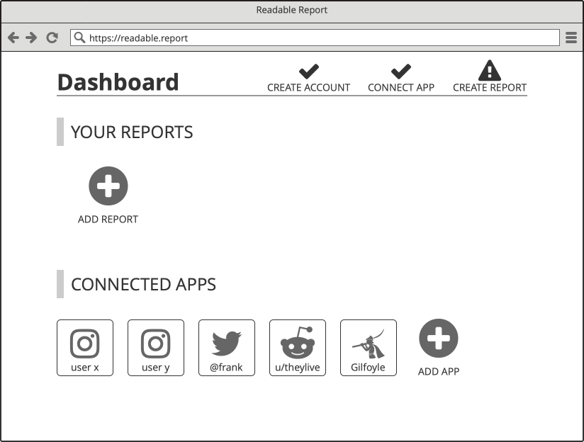
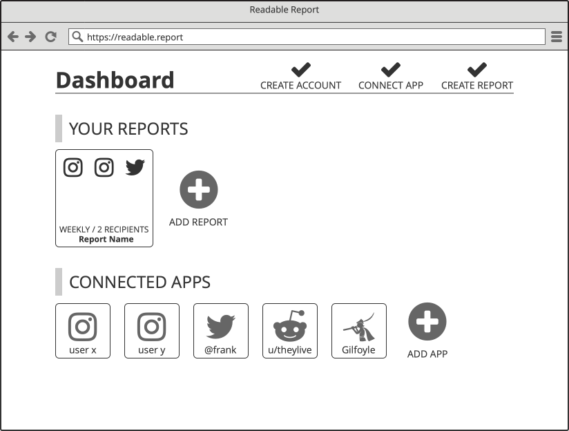
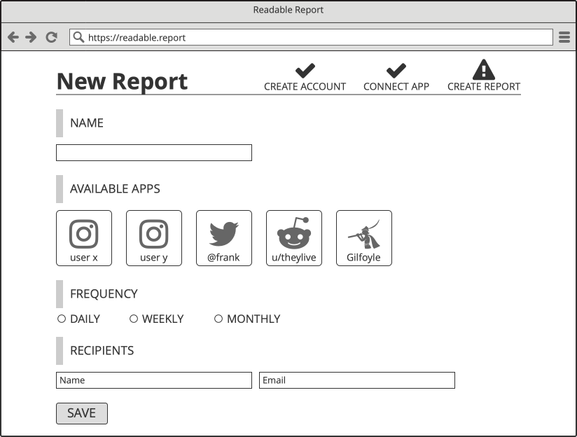
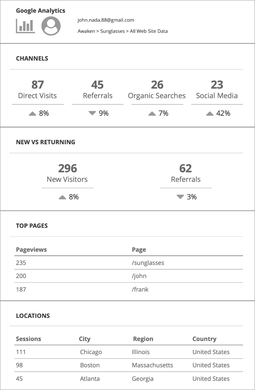
REPORT & DASHBOARD WIREFRAMES
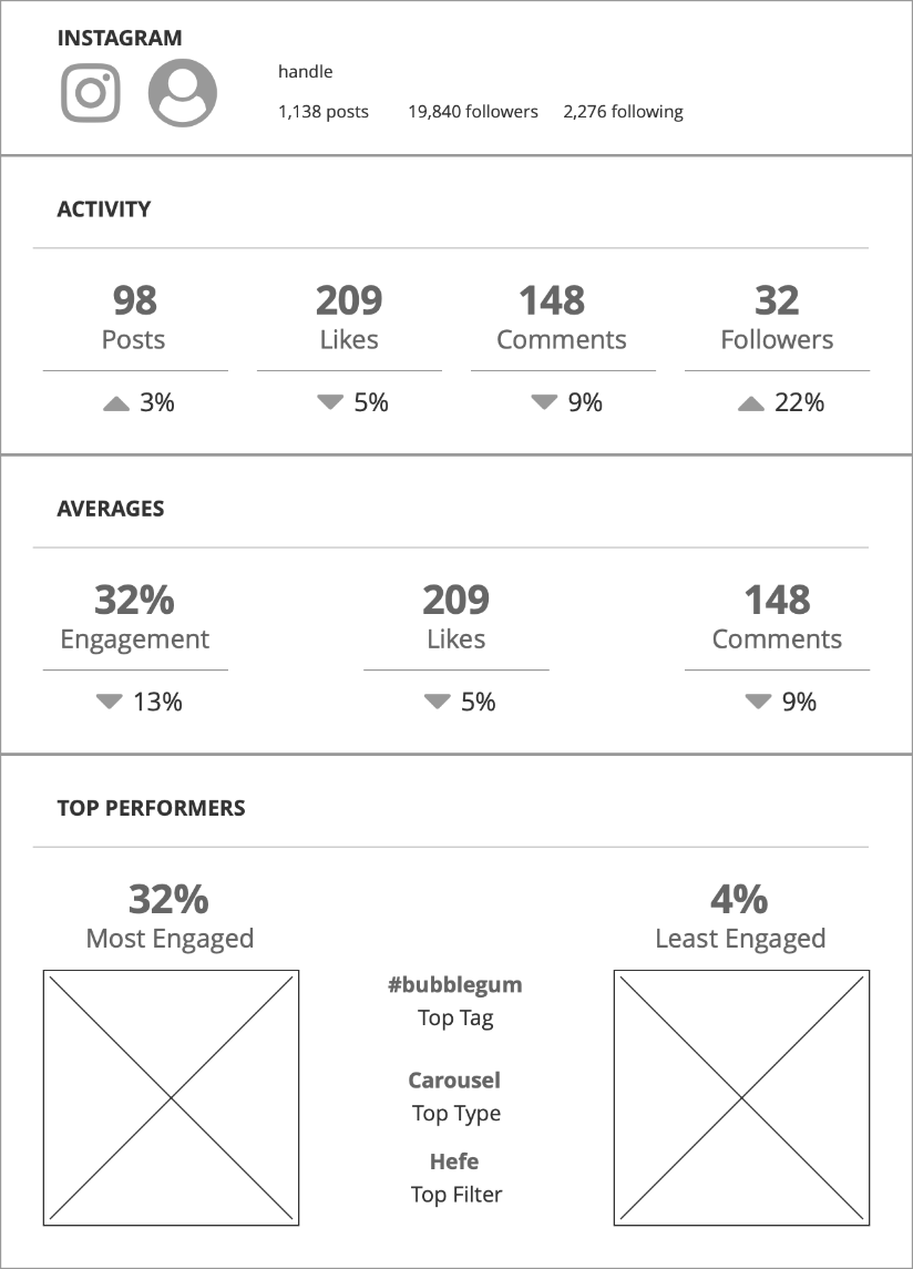
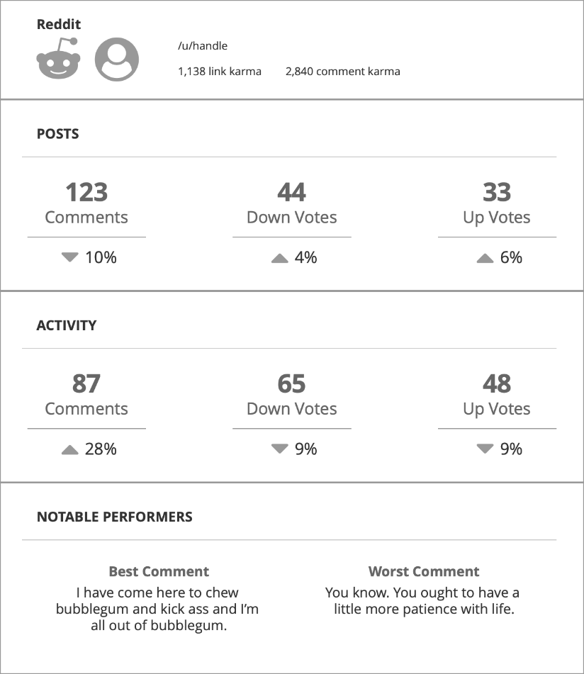
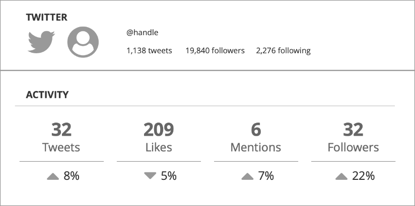
Building off the acquired data, the next step was to up the fidelity a bit and build out wireframes for the proposed reports and dashboard.
Seeing app-specific metrics in this form for the first time was intriguing as the usefulness of viewing different bits of data all at once was readily apparent.

ONBOARDING WIREFLOW
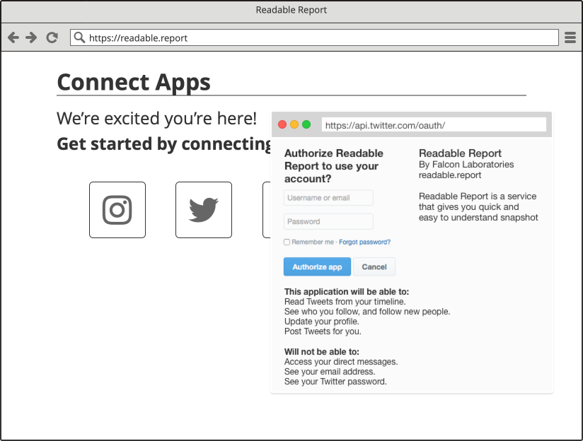
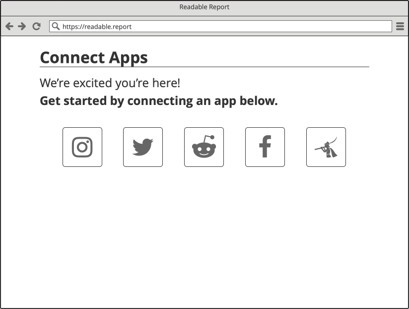
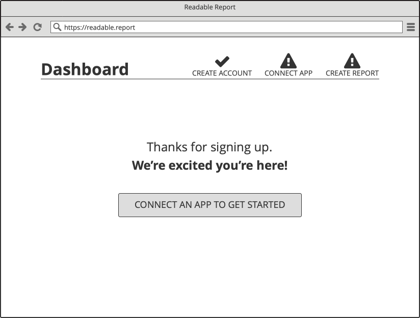
I created a wireflow to gain a clear idea of how the onboarding process would function.
In addition, each step in the onboarding process was tied to multi-stage email automation to welcome, instruct, and nurture new users. These are shown in context and with the appropriate triggers
REPORT & DASHBOARD VISUALS V.1
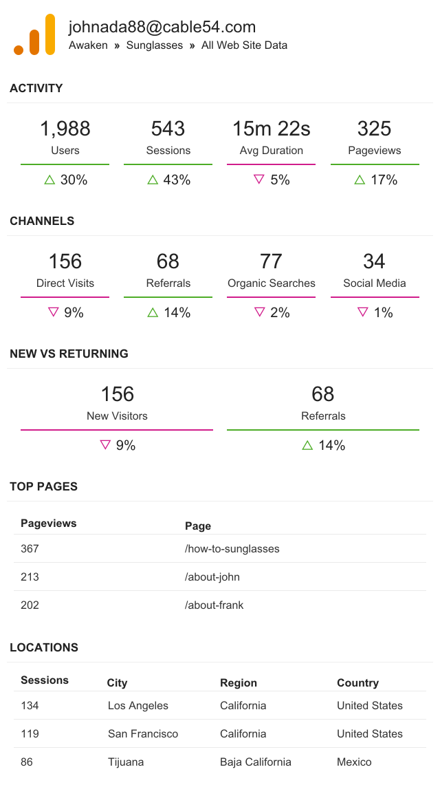
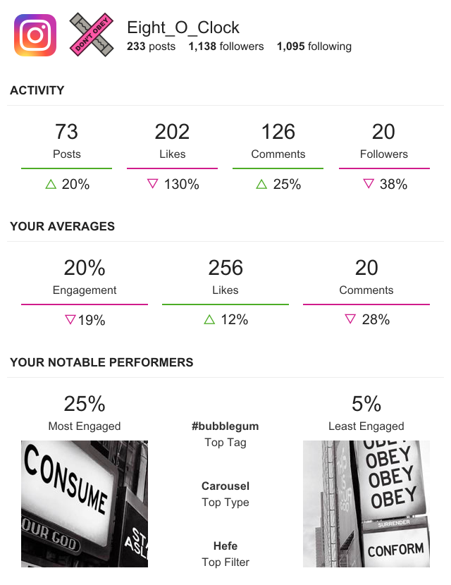
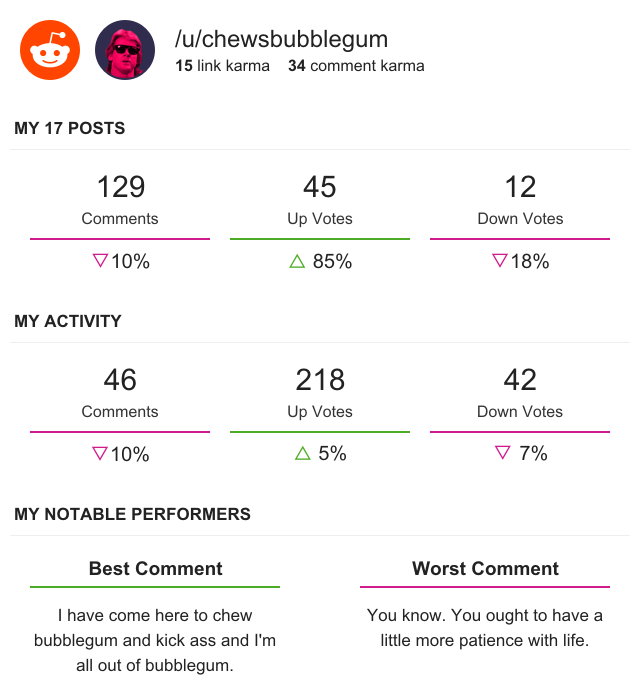
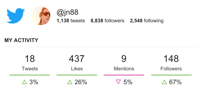
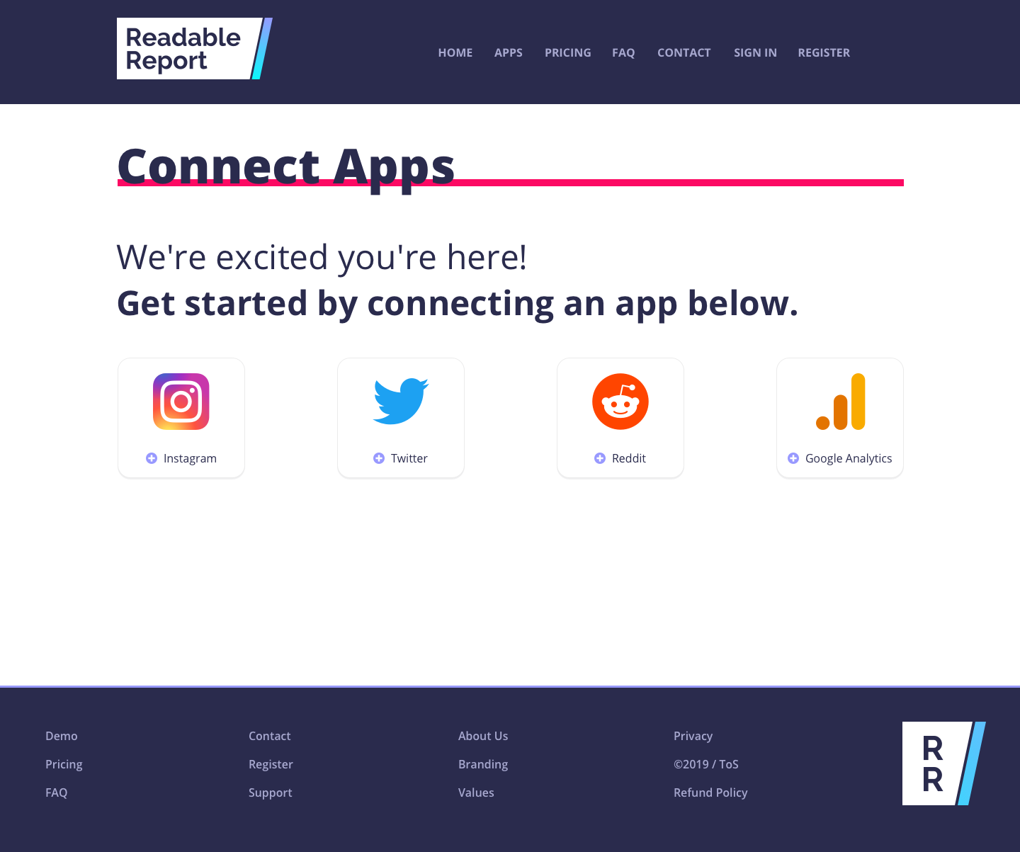
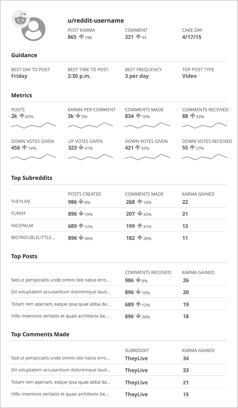
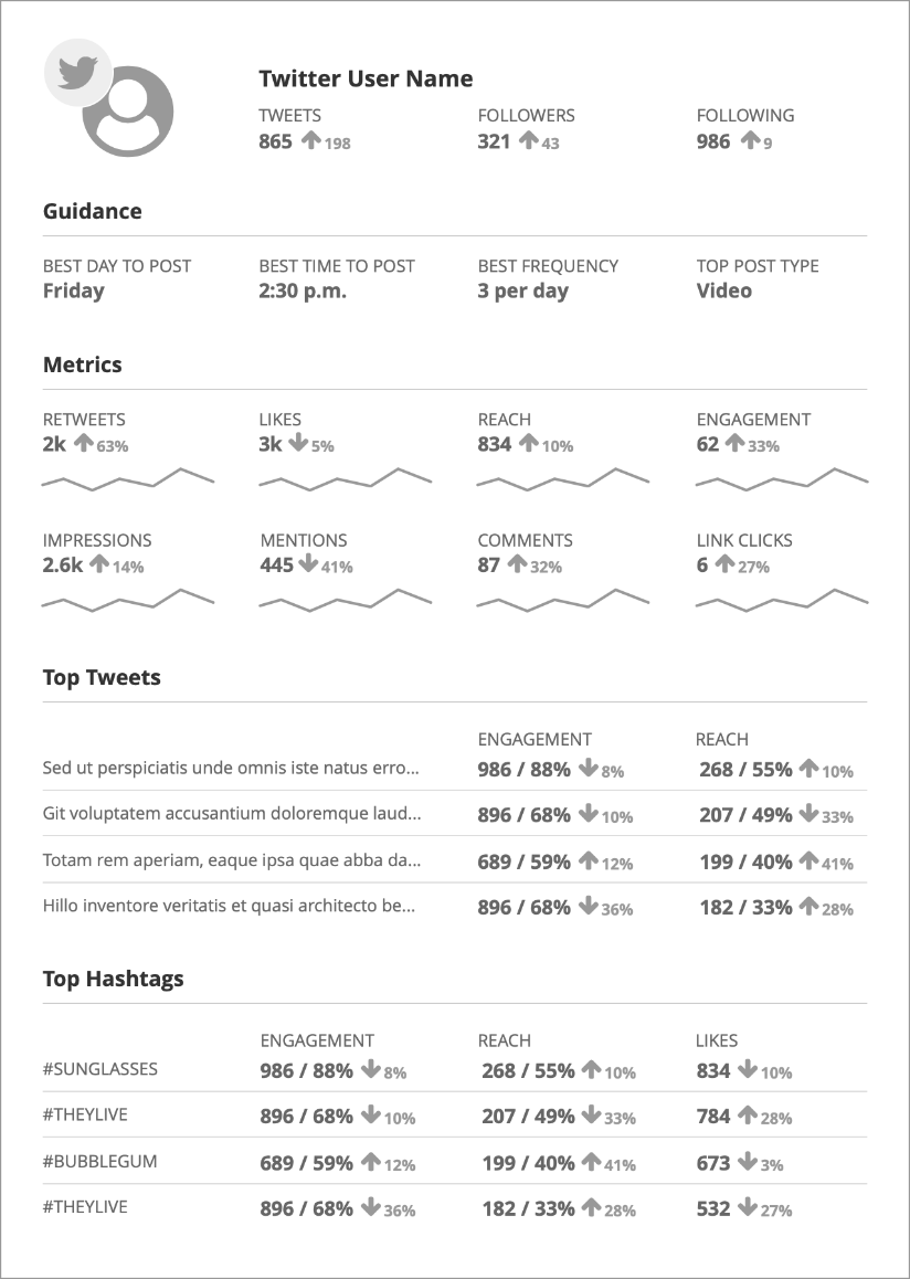
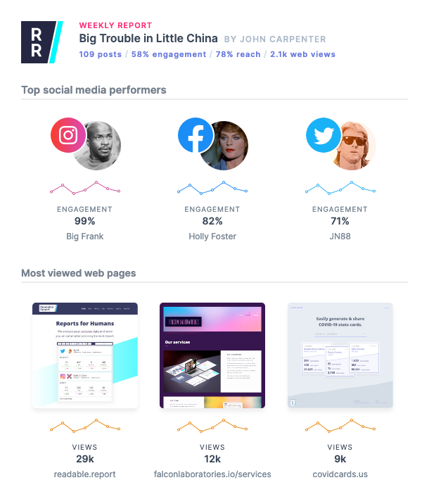
Below are the initial finished versions of the reports for Google Analytics, Instagram, Reddit, and Twitter. I built these reports with MJML and they were designed to be dynamic and flexible while displaying nicely in all major email clients.
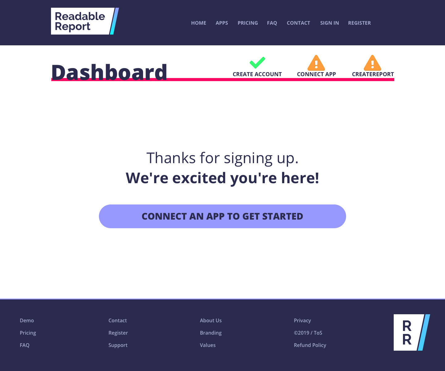
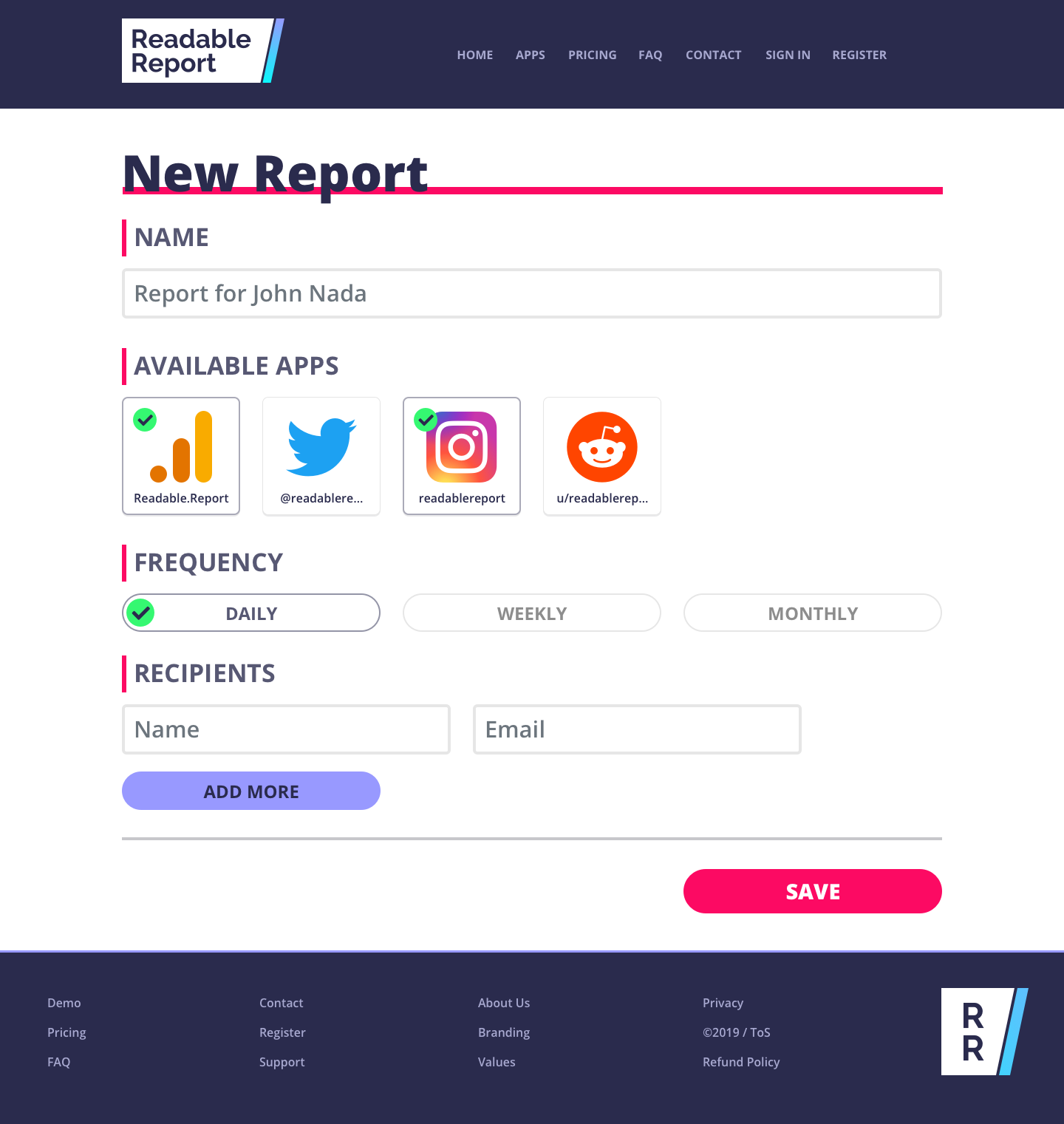
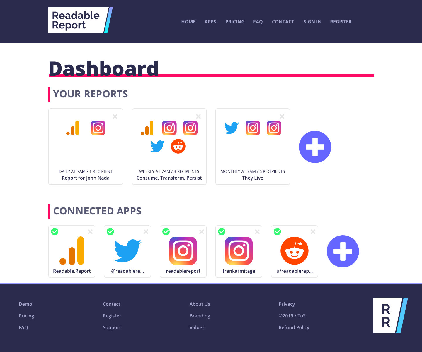
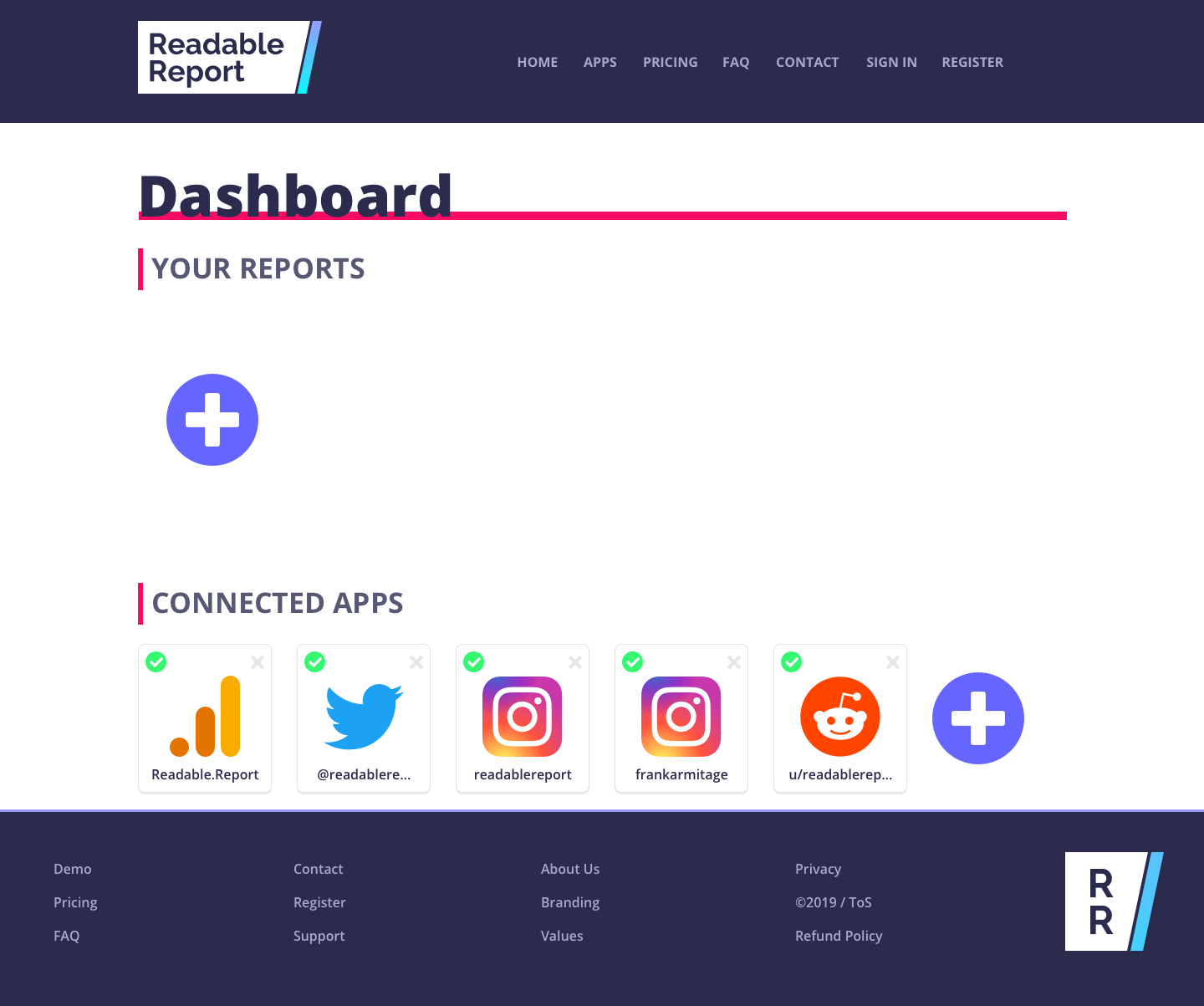
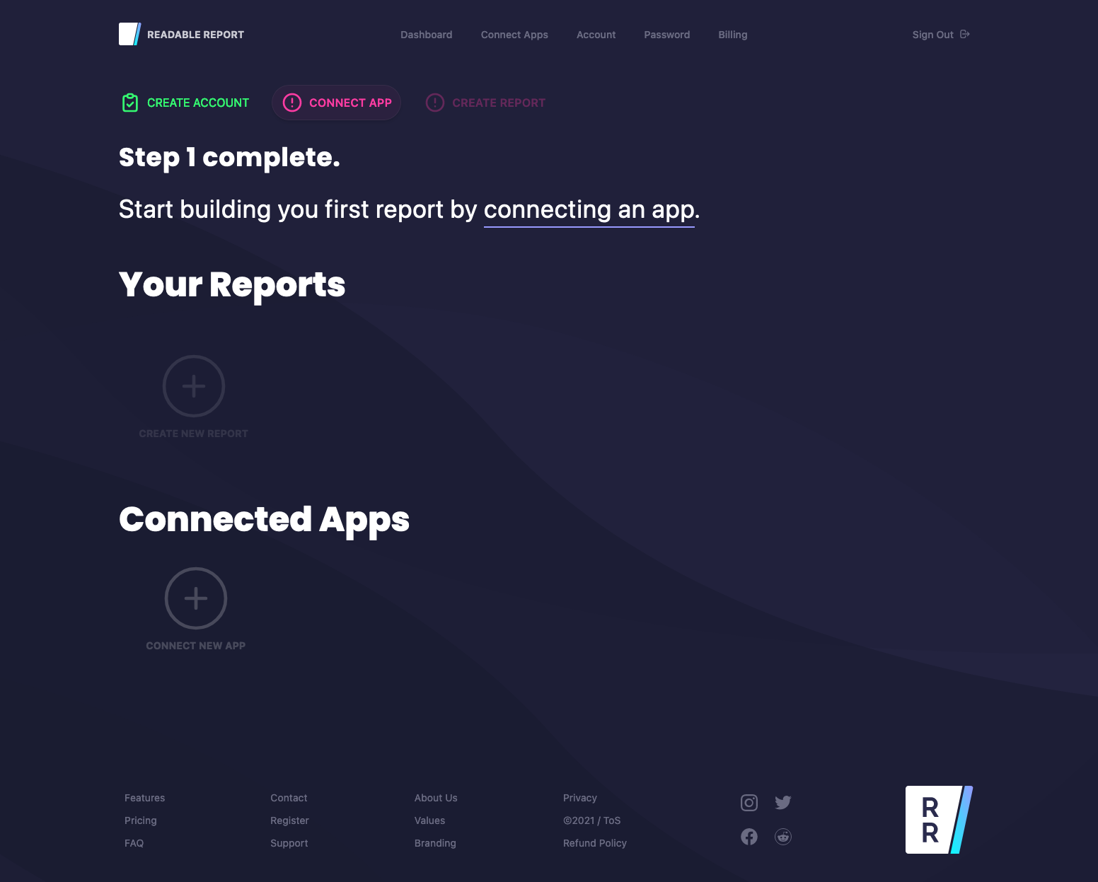
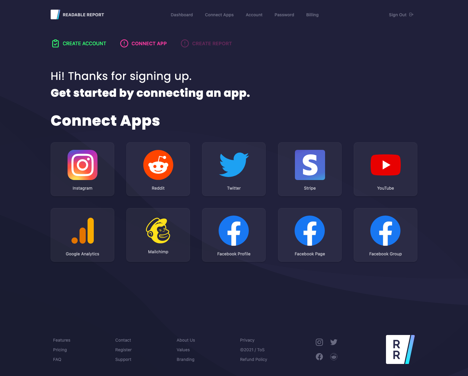
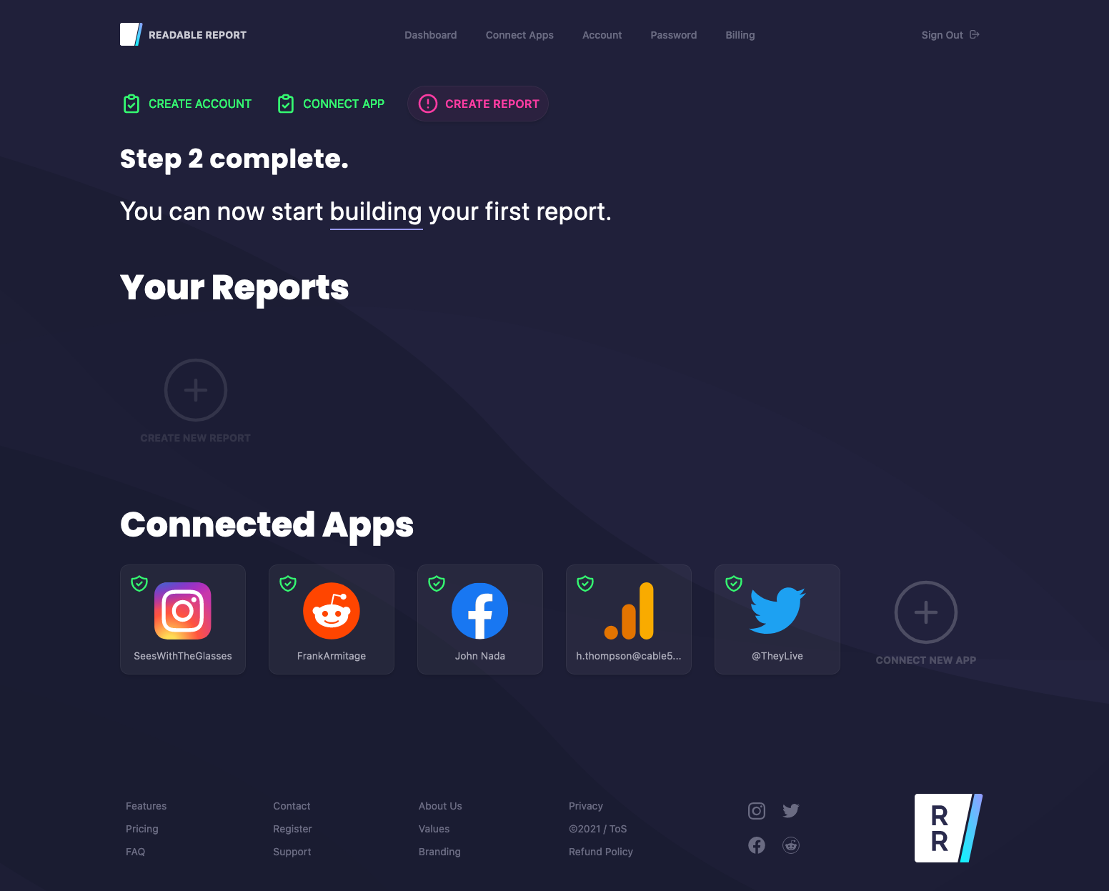
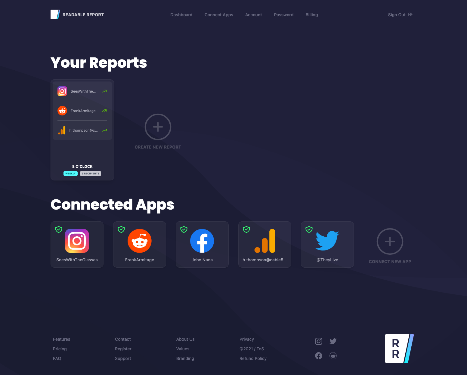
Also, the dashboard visuals are shown with the five major dashboard states: landing page after registration, dashboard with no apps authorized or reports built, dashboard after authorizing apps, new report generation, and dashboard with apps and reports.
ONBOARDING USER JOURNEY
After going through the process of generating user research, sketches, wireframes, and finished artifacts the next step was to test what was in place.
By monitoring users and recording feedback, I was able to put together a user journey for the onboarding process.
A few key improvements were made after reviewing the data from the completed user journey.
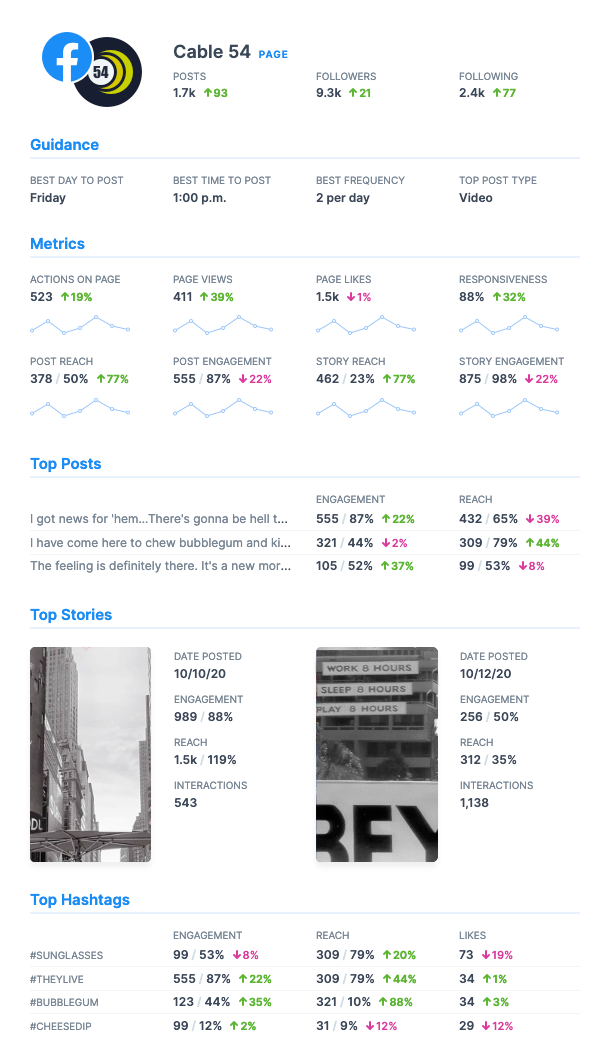
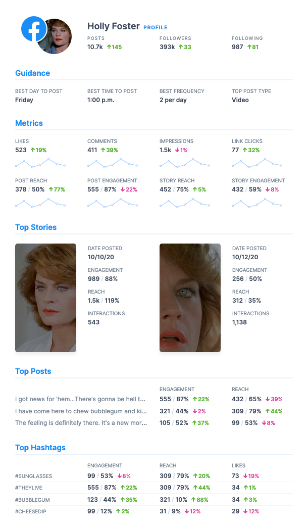
The first change to product development was to increase the number of supported apps by adding Facebook Profiles, Facebook Pages, and Facebook Groups.
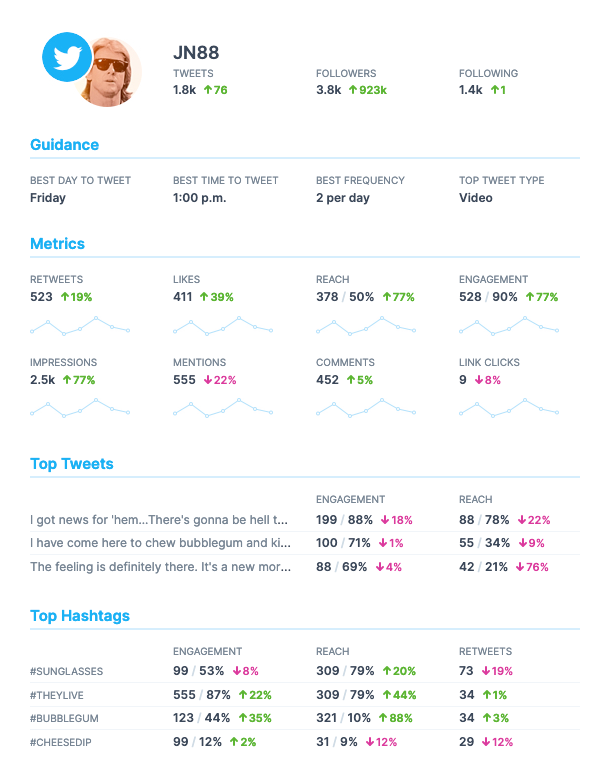
Secondly, reports were given much more depth by including more metrics, posting guidance suggestions, and a roll-up summary to begin each report.
Users were often reticent to sign up for another account that required a credit card, found the app authorization process jarring, and were wary of their data being viewed by others.
To address the experience issues the credit card requirement was removed, more care was spent in educating users on what would happen during app authorization, and a clear data, plain language, privacy section was established.
UPDATED REPORT SKETCHES
These sketches began the development of more robust reports featuring more metrics, post guidance, and a summary at the top of each report.
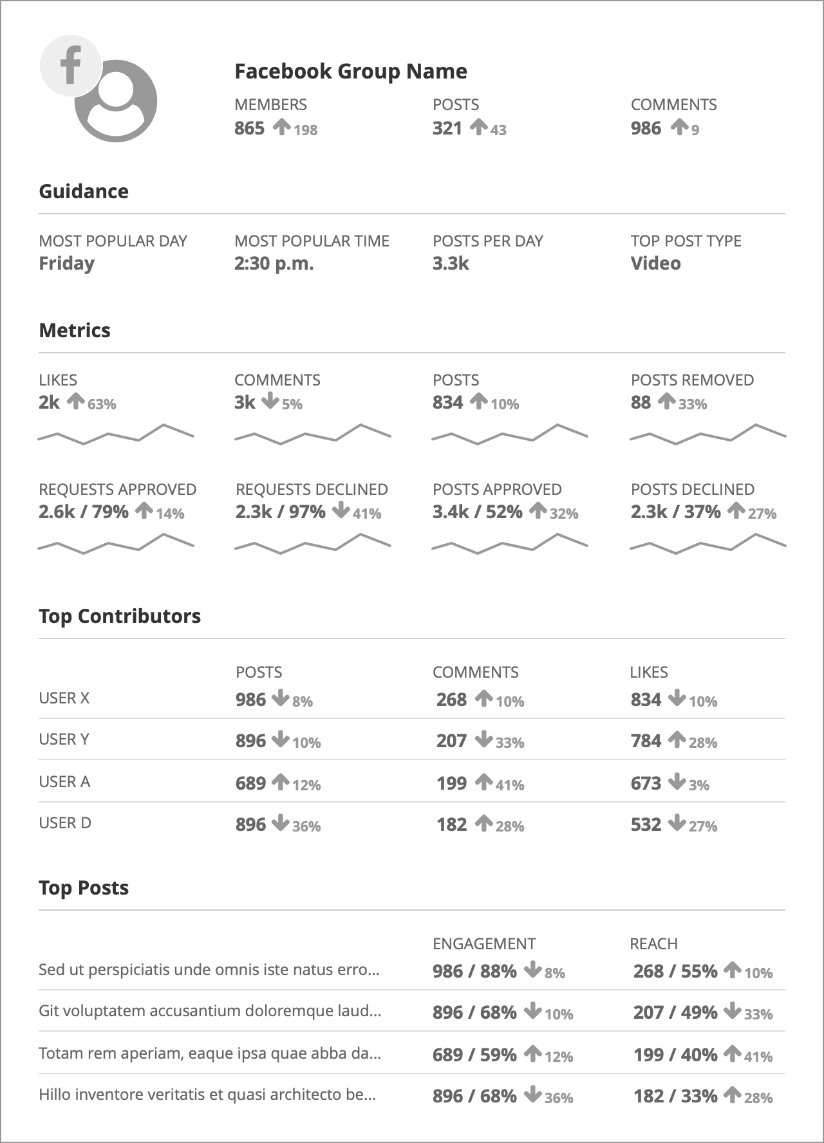
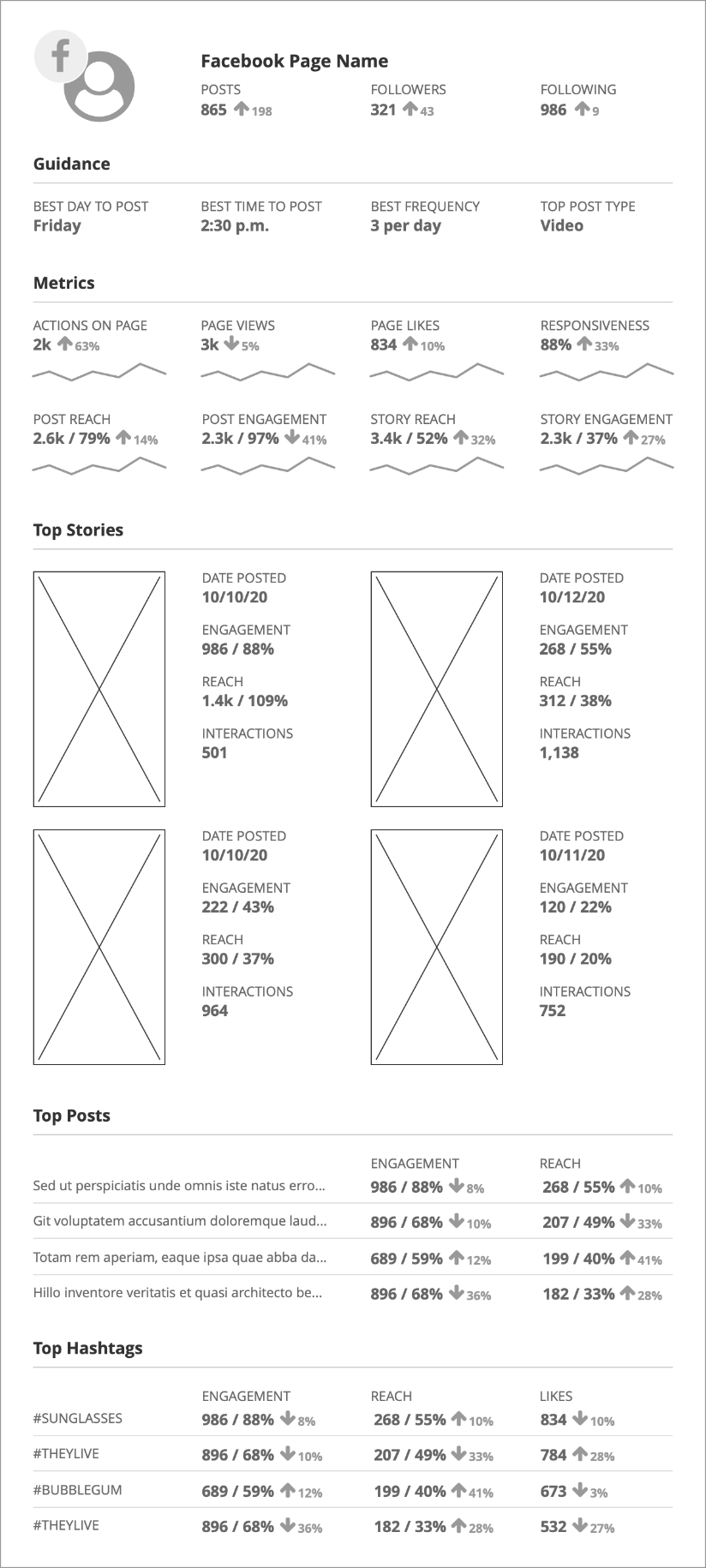
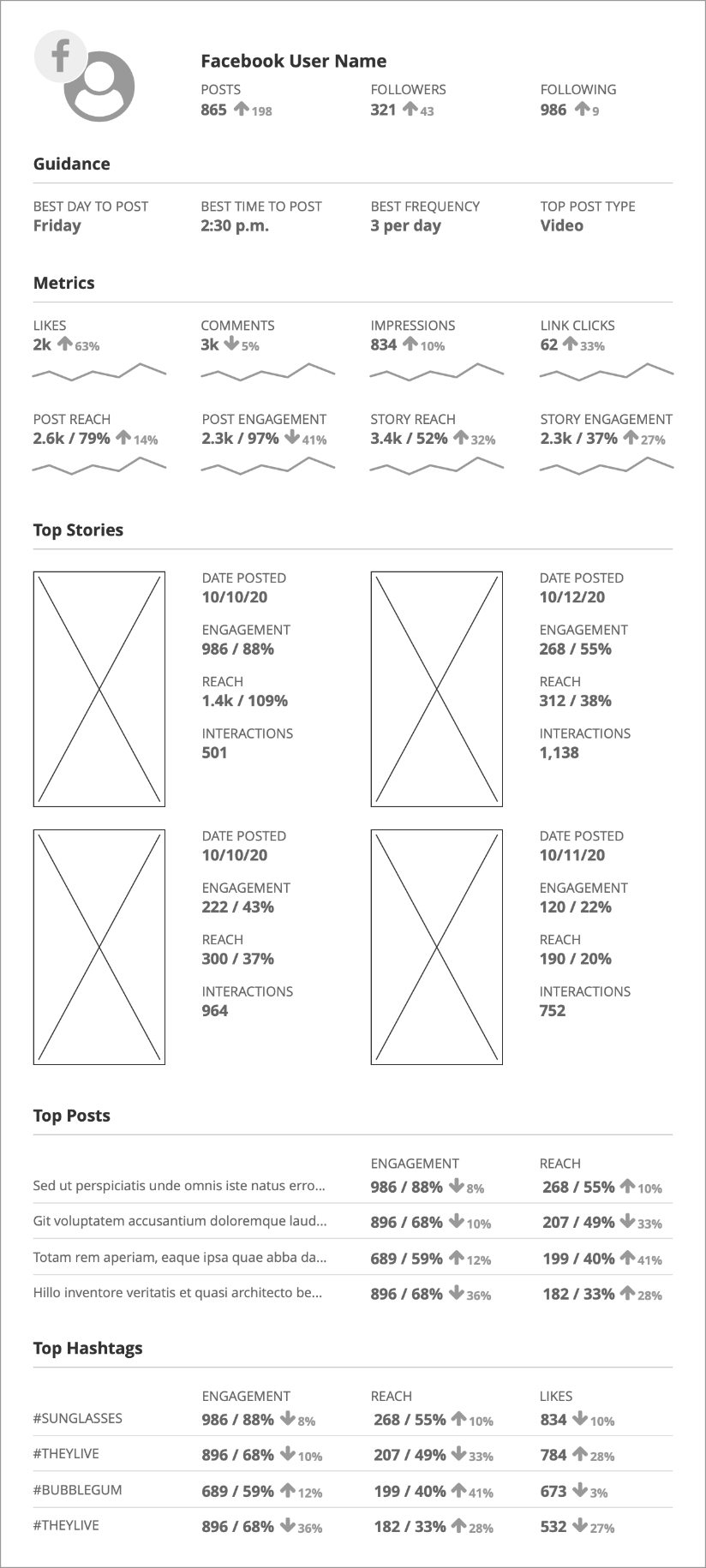
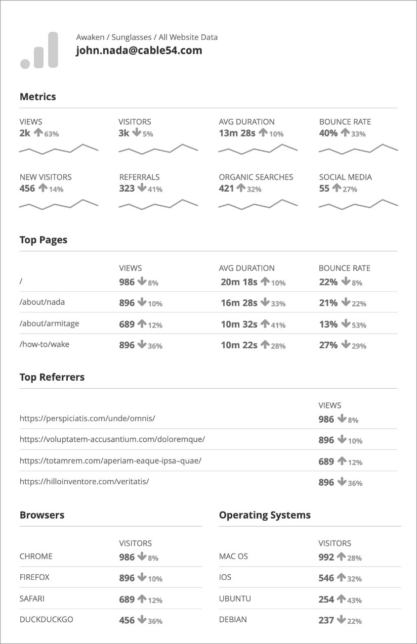
UPDATED REPORT WIREFRAMES
Taking the updated report sketches a step further into wireframes brings the new features into a clearer view. There are many new metrics, stats, and updates.
The updated reports now show users more actionable detail without being overwhelming and complicated.

UPDATED REPORT & DASHBOARD VISUALS
Fully visualized reports clearly show the new metrics and the app-based color-coding helps to quickly identify the content. Again, these reports were built and function dynamically with MJML.
The dashboard visuals appear much different than the initial version, but the majority of the structure, rules, and layout remain the same.
Although the site structure remained the same there was one small change that made a big impact. The onboarding steps widget now appears on every page of the dashboard. This allows users to stay informed of their progress no matter where they go in their dashboards.
The overwhelming bulk of the new design was developed in the source code as the structure did not change. I drew some new background shapes, but the design process was carried out with VueJS and Tailwind CSS.
I find there can be great advantages to designing and prototyping with HTML and CSS as the finished product will be pixel perfect. No translation required from Figma or Sketch to code.






MARKETING VISUALS
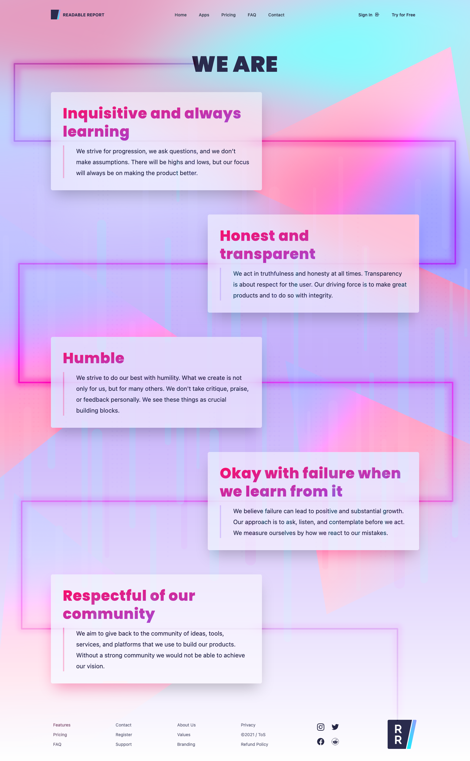
The marketing visuals took on the same new modern design style as the previously discussed dashboard updates.
As with the new dashboard, the majority of the design process took place with VueJS and Tailwind CSS. This process is more efficient especially if the basic site structure does not change.
From a creative standpoint, I work from maximum to minimum. I add as much as possible to a design and then peel back any unnecessary or superfluous bits.
When I approached the new design I wanted to ground it in approachability. As a data-centric product, it can be tempting to lean too heavily on the rational aspects and neglect the emotions and feelings a user has while using the product.
It was of equal importance to deliver fast and accurate metrics and guidance along with providing the busy small business owner an experience that they would want to return to repeatedly.
This thought needed to be foremost in their head before they sign up because if they were to see any portion of the process as unenjoyable they would be less likely to register.
A major change between the initial version of the site and the updated look and feel was the addition of more descriptive general and app-specific features pages. A closer look at how the system works and then how that translates to particular apps.
REVIEW
Throughout the planning, designing, and building of each minute aspect of Readable Report I relished every success and failure.
The design process is about finding new and novel solutions to problems and without successes and failures progress stops. Readable Report showed this axiom to be true.
Connecting a seemingly endless number of parts and components to form a unified artifact is the true superpower of design. Readable Report exemplified this notion in so many ways. I saw the immense value of acutely understanding the expectations of the audience, while stressing open communication about the goal, at each stage of the research process.
Driving such a large project strengthened my belief that no idea should be held as too precious as doing so will lead to failure in identifying the actual needs and challenges of the audience. Holding onto one thought too tightly will often do serious harm to a project.
I take pride in the effort I put into Readable Report and I sincerely value everything the project taught me along the way.
Great challenges require small steps. The importance of focusing on small incremental steps can not be overstated. Large complex changes can't be done overnight, as I witnessed firsthand.
Learning to trust a more strategically minded approach brought positive results and showed the advantage of decisive planning and careful research.


